If you run a cleaning business, I have bad news for you. Your website is probably not very good. The reason I say this is because most cleaning websites are poor at converting traffic into leads.
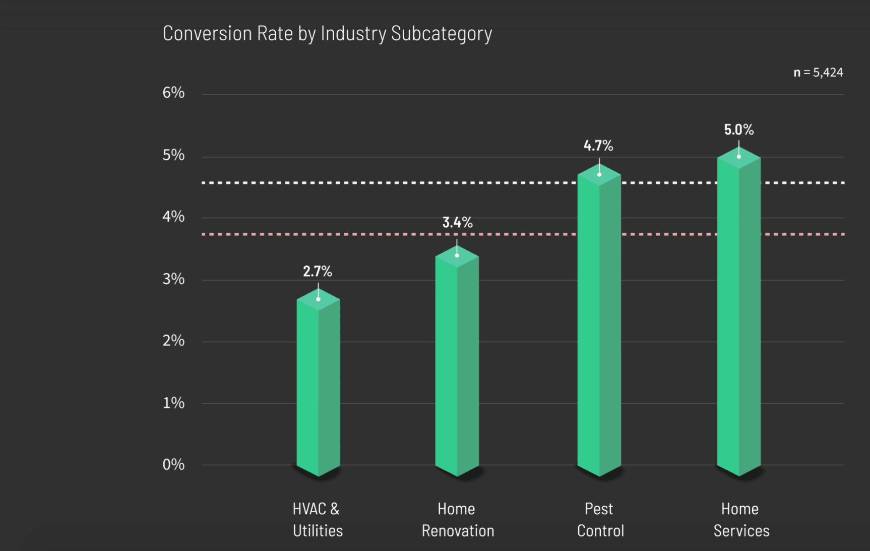
Let’s take a look at the industry standards. Cleaning websites (home service) only convert, on average, 5% of their visitors into leads, which means that for every 100 people who visit their website, only 5 of them will make an enquiry. The math is simple; less leads = less paying customers. The reality is your website is probably in that statistic. It’s losing you money, and that sucks.
The good news is I know how you can instantly improve that statistic. At Digitool, my job is optimising websites for home service businesses. Specifically, I make sure web traffic gets transformed into paying customers. This is known as UX design or conversion optimisation.
I want to share with you the reasons why most sites struggle to convert their leads and how I help my cleaning clients fix them. Over three seperate blog posts, I’m going to talk you through the precise reasons most sites don’t convert, and what to do about them. In fact, I’ve helped businesses increase conversion rates by over 600%… want to know more?
1. Lack of Confirmation
How to fix a lack of confirmation
One of the most fundamental problems most cleaning websites have is a lack of confirmation. When a person enters your site they need instant confirmation that they’ve made the right choice. They want to know that your site can help them with exactly what they’re looking for, and guess what? It takes less than 1 second to make that decision. This means if they’re in any doubt, they’re pressing that back button and it’s adios.
Your site therefore has to confirm to its visitors, beyond any doubt, that you’re exactly what they’re looking for. It’s a tough task, but it’s 100% doable if you focus on these 3 areas: a primary headline; colour; and a hero image.
Primary Headline
The primary headline is the biggest piece of text at the top of the webpage, which you can make the most out of by:
- – Making it instantly visible when your page loads, without the need to scroll;
- – Use it to clearly tell people exactly what your business does;
- – Make it no more than 6 words so it’s clear and easy to understand.
The secret for creating your stand out headline is simple. People often get caught in the trap of selling. Don’t do this. Instead, mirror what your customer has searched to find you. People normally search for the service they want, and location they want it in, so be sure to include that in your headline.
Example of a bad headline
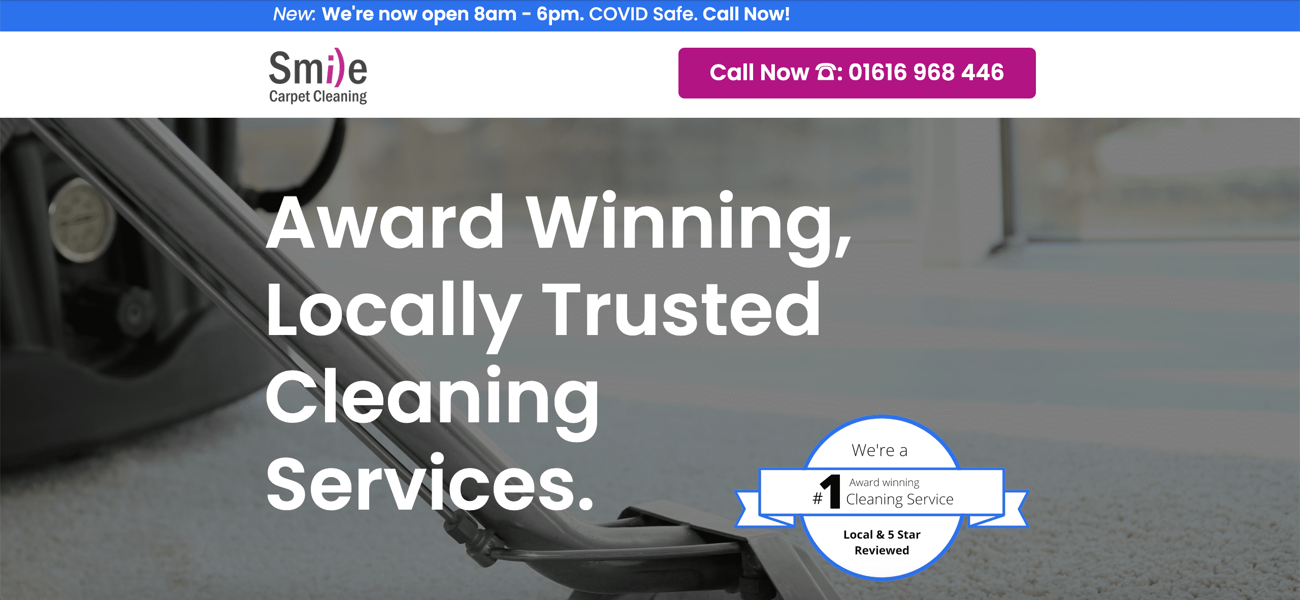
This headline does sell your business, and maybe it sounds great but it’s vague. It doesn’t confirm what types of cleaning you do, where you do it, and what local means. There’s zero confirmation.
Example of a good headline
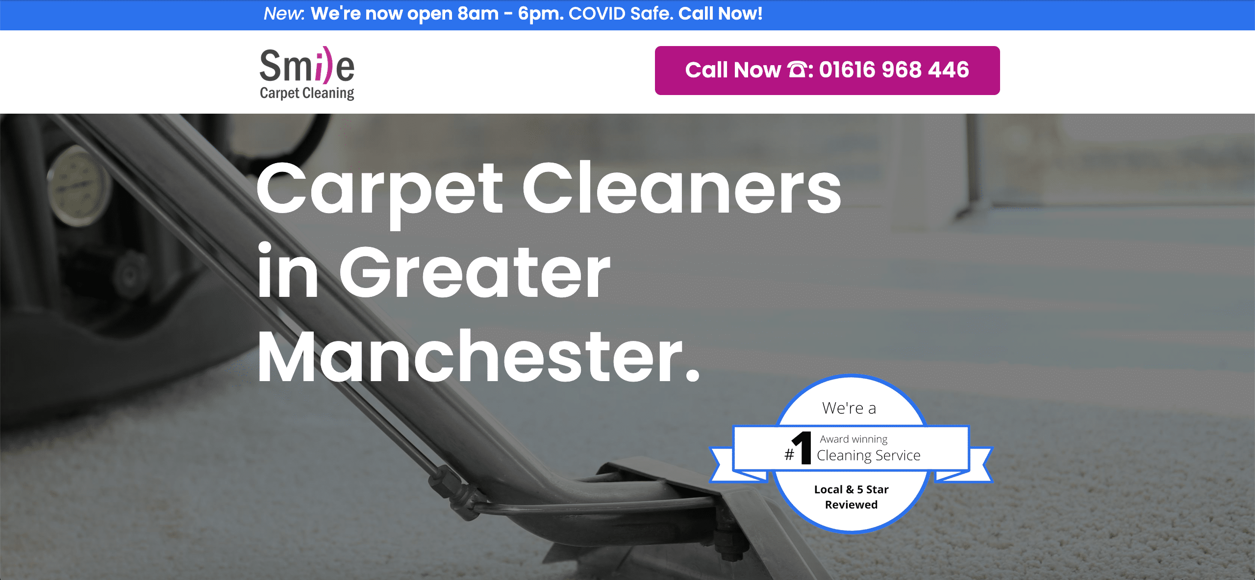
Unlike the bad headline above, this one is basic. It clearly confirms to anyone who sees it exactly what you do and where you do it in less than 1 second. It seems counterintuitive, but this is much more effective.
Confirmation is key. Confirm first, sell second.
Colour
Using colour is essential for grabbing people’s attention. Most cleaning websites are a mix of soft colours, such as blues, greens, whites, and greys. This makes a site look clean, but it doesn’t get people’s attention. Also by using soft colours across an entire page, the important parts don’t stand out meaning they’ll most likely be missed.
Try to use bright contrasting colours. Doing this will pull people’s eye towards the things you want them to see. The top things you want to call attention to are your headline, phone number and contact form. If you draw people’s focus to these key items, it’s more likely that they’ll acknowledge and engage with them.
Hero image
One of the best ways to communicate is through images. That’s because it’s a scientifically proven fact that the human brain can understand an image 60,000 times faster than text.
The hero image is the biggest visual at the top of a page. When someone visits your site, it’s the first thing they will see. It’s also the first thing their brains will decode and understand, so it’s vital to have a hero image that communicates a crystal clear message about what you do. Getting this part right will go a long way in helping your customer’s confirmation.
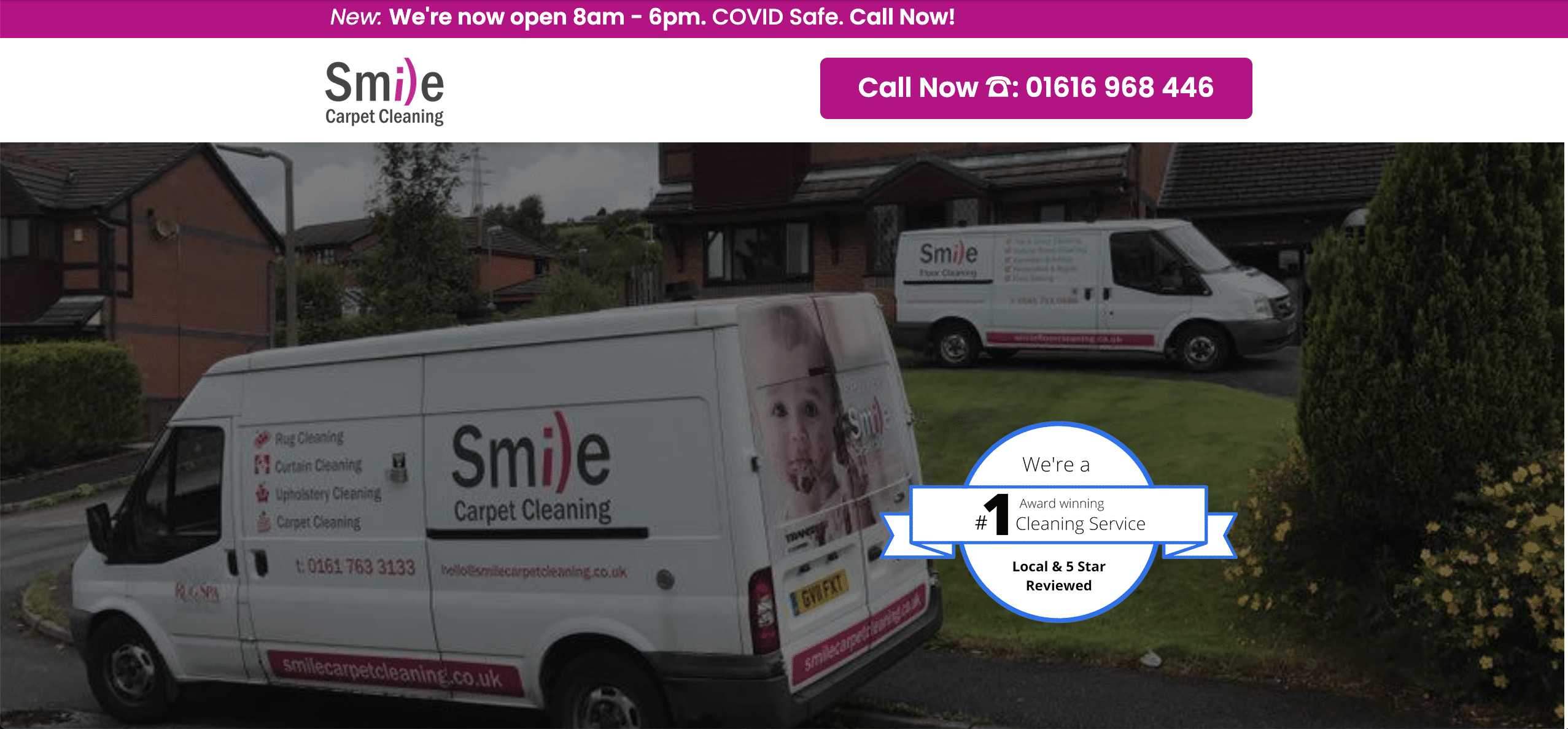
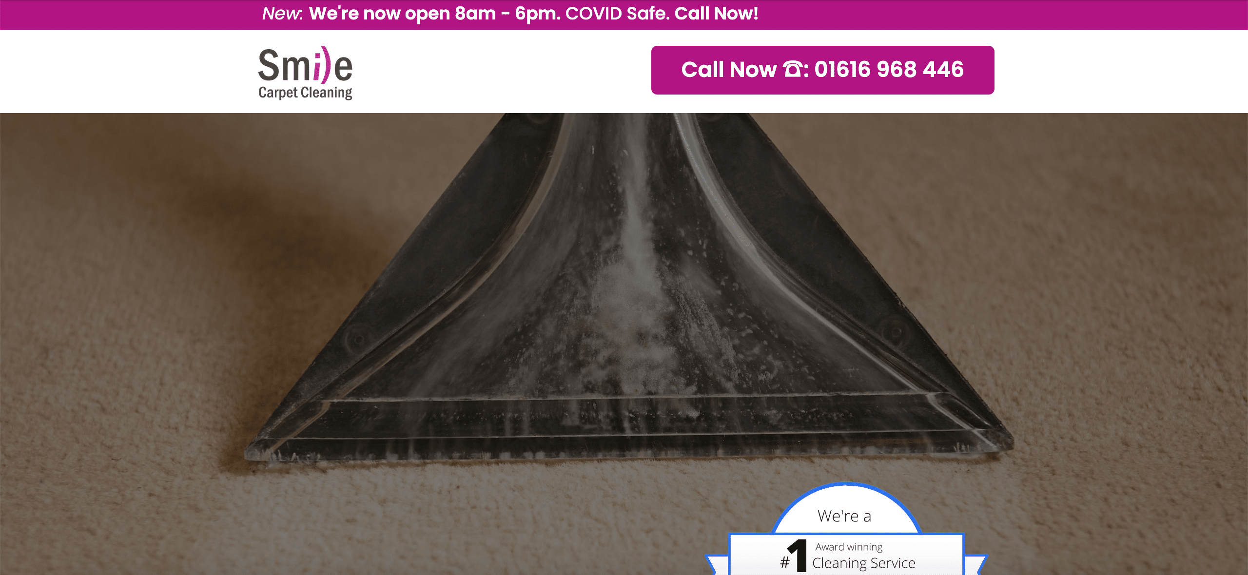
The most important part when picking a hero image is checking it can be fully understood without the need to read any text. If an image cannot effectively communicate what you do by itself, it will not give the visitor the confirmation we need.
Example of a bad hero image
Example of a good hero image
See you in part two?
That brings us to the the end of part one. Want to know more about why cleaning websites struggle? Check out part two. Alternatively, if websites aren’t your thing or you simply don’t have time, the Digitool team are here to offer professional help. Contact us today to find out more about how we can help.
